Please note: Specific button text, filter labels, and identifiable features in these prototypes have been replaced with placeholders to comply with non-disclosure agreements and protect core features. However, the design processes and methodologies presented remain accurate.
After crafting a high-fidelity prototype that earned overwhelmingly positive feedback from stakeholders, I identified the next critical gap — the absence of a design system to support full product development. As the sole designer on an AI-driven grocery app bridging consumers and local small businesses, I built the visual language, accessibility standards, and component architecture from scratch — creating the foundation the team needed to scale.
My Role
Sole designer — owned every decision from brand color to component architecture
Objective
To streamline design-to-development handoff
Establish WCAG 2.1 compliance from scratch
Architect components that scale across the full product
Outcome
Pitched and led accessibility initiative to founders
Delivered token documentation adopted by engineering
Created the design foundation the team needed to scale

Scaling from prototype to full product exposed three critical gaps — each requiring a different design system solution.

Situation
No shared visual reference existed — design decisions were made inconsistently across screens.
Risk
• Fragmented UX across screens
Slow design-to-development handoff
Approach
Established a single source of truth — token system and component library.
Situation
The prototype was built without WCAG compliance — accessibility had been deprioritized in favor of feature showcase.
Risk
Poor contrast reduces readability for all users
Inconsistent hierarchy creates visual confusion
Color-only signals fail users with visual deficiencies
Approach
Introduced WCAG 2.1 compliance as a foundational requirement, not a retrofit.

Situation
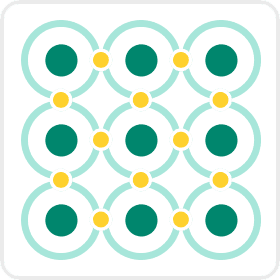
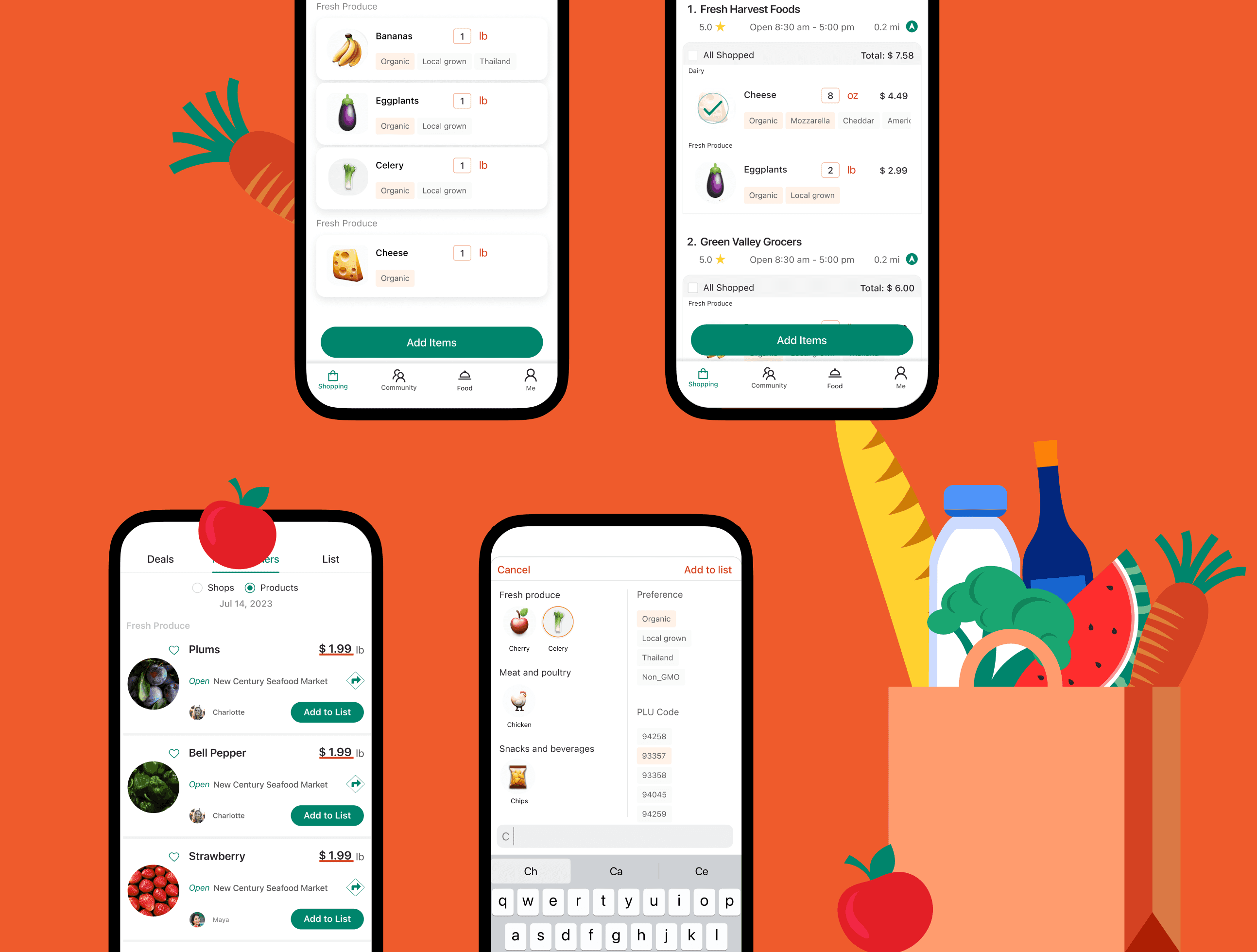
The app surfaces both user-created lists and community-curated items — each requiring distinct visual treatment.
Risk
• Users can't distinguish content origins instantly
Inconsistent presentation undermines trust
Approach
Designed cards with consistent structure and deliberate visual variation for instant recognition.
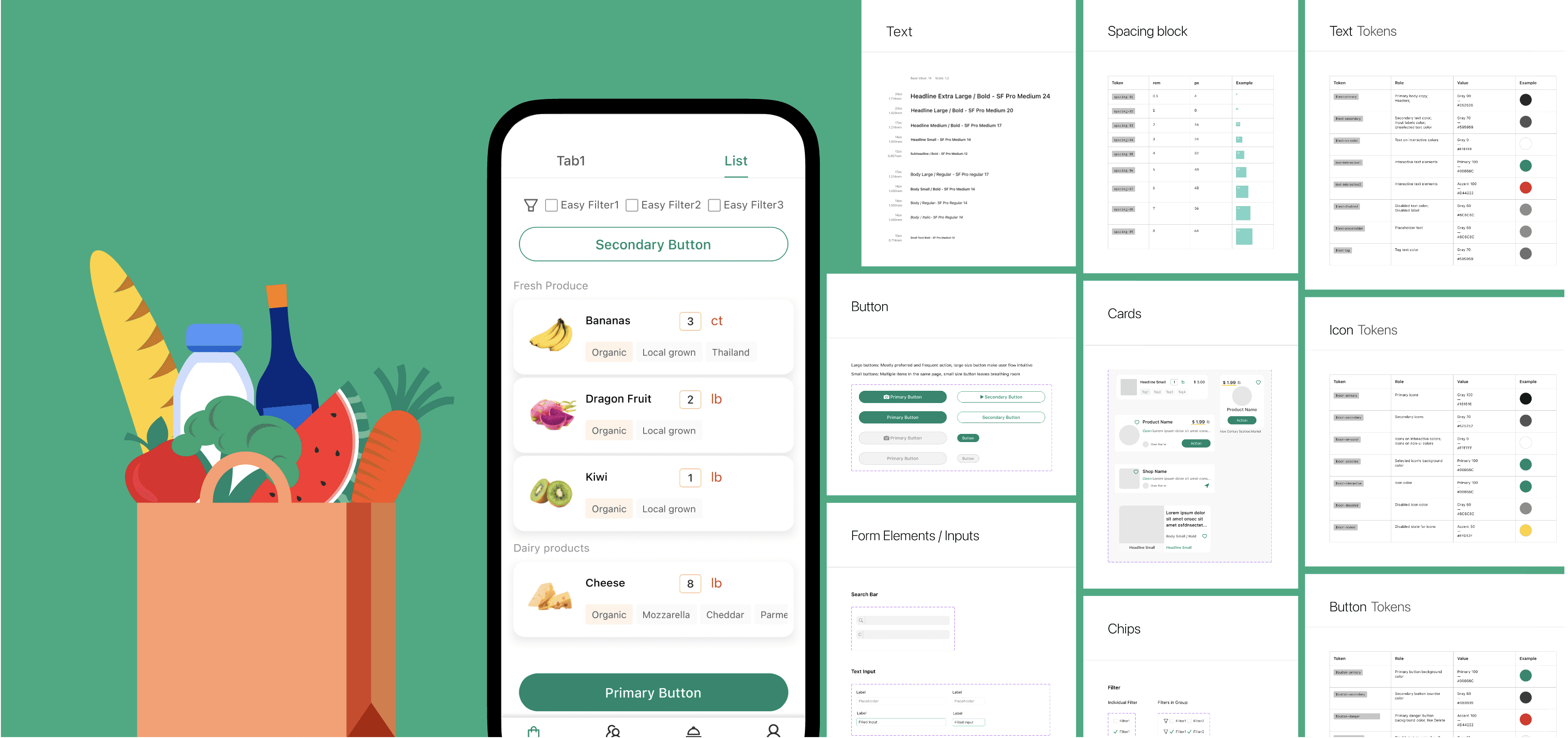
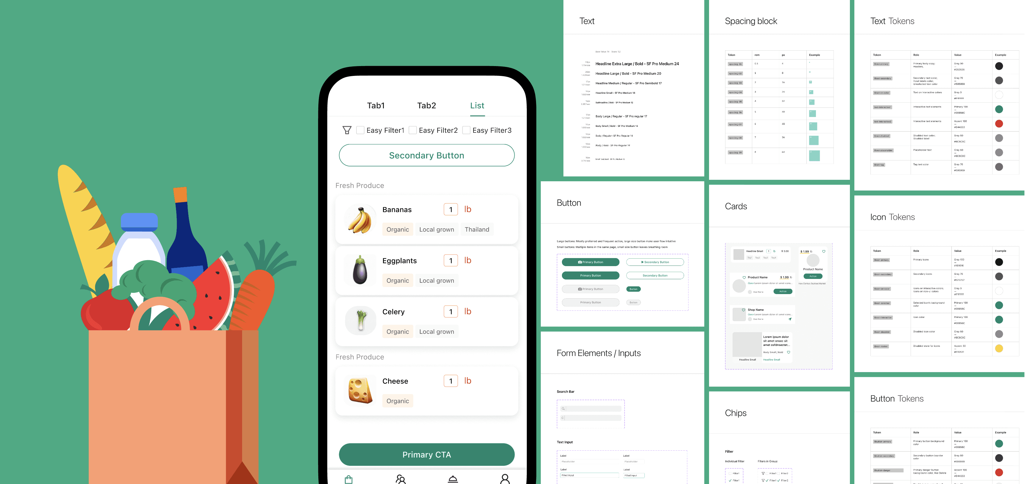
Atoms

Molecules
Organisms
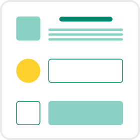
Templates
Pages
With a new grocery shopping app in development, there was a need for a design system to guide its visual and interactive aspects.
Focus
• Text size-specific contrast
• WCAG 2.1 AA & AAA standards
• Hue independence
• Lightness contrast between colors
Tools
• Adobe Color - Contrast Checker
• Adobe Color - Color Blind Safe
• Coloring for Colorblindness
• Stark Accessibility Tools
Color only works if people can read it. I established contrast ratios meeting WCAG 2.1 AA and AAA standards across all text sizes.
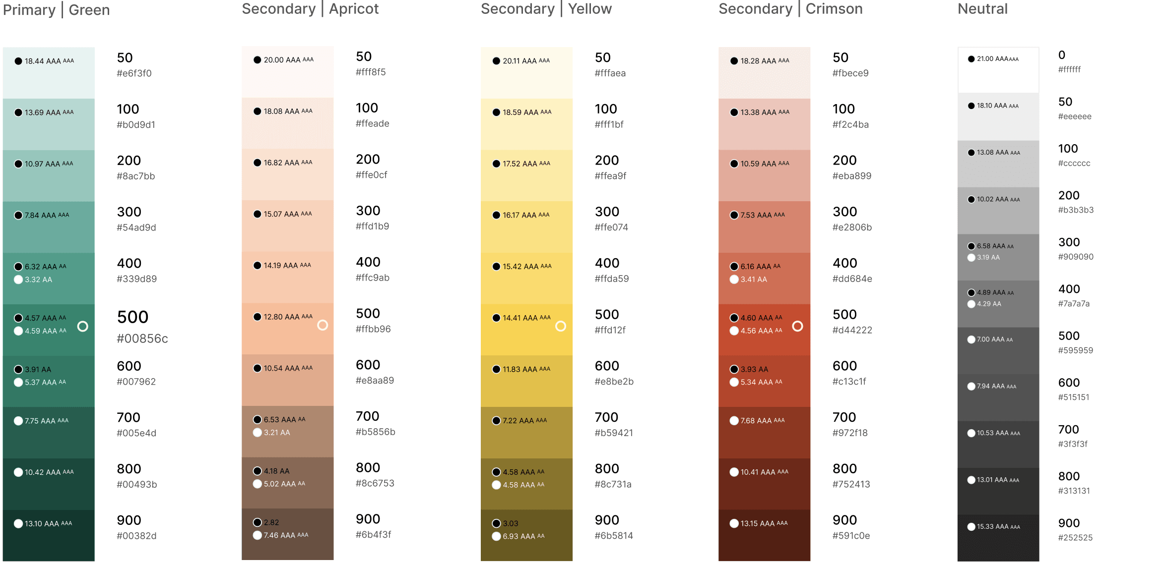
But contrast alone isn't enough. I tested every brand color under the three major Color Vision Deficiency (CVD) types to ensure the palette stays distinguishable for the approximately 13 million Americans living with color blindness — even when hue differences are lost.
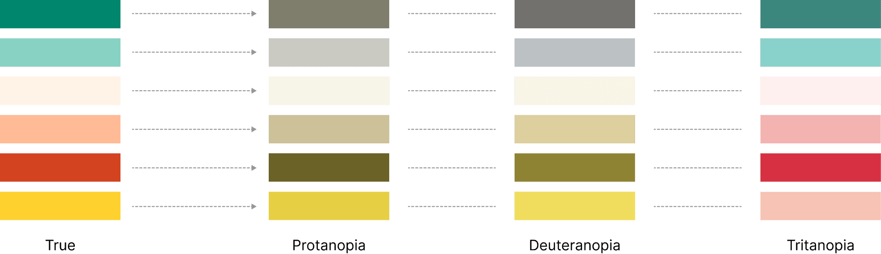
The outcome is a color system that works for everyone — sighted, low vision, and color blind users alike.
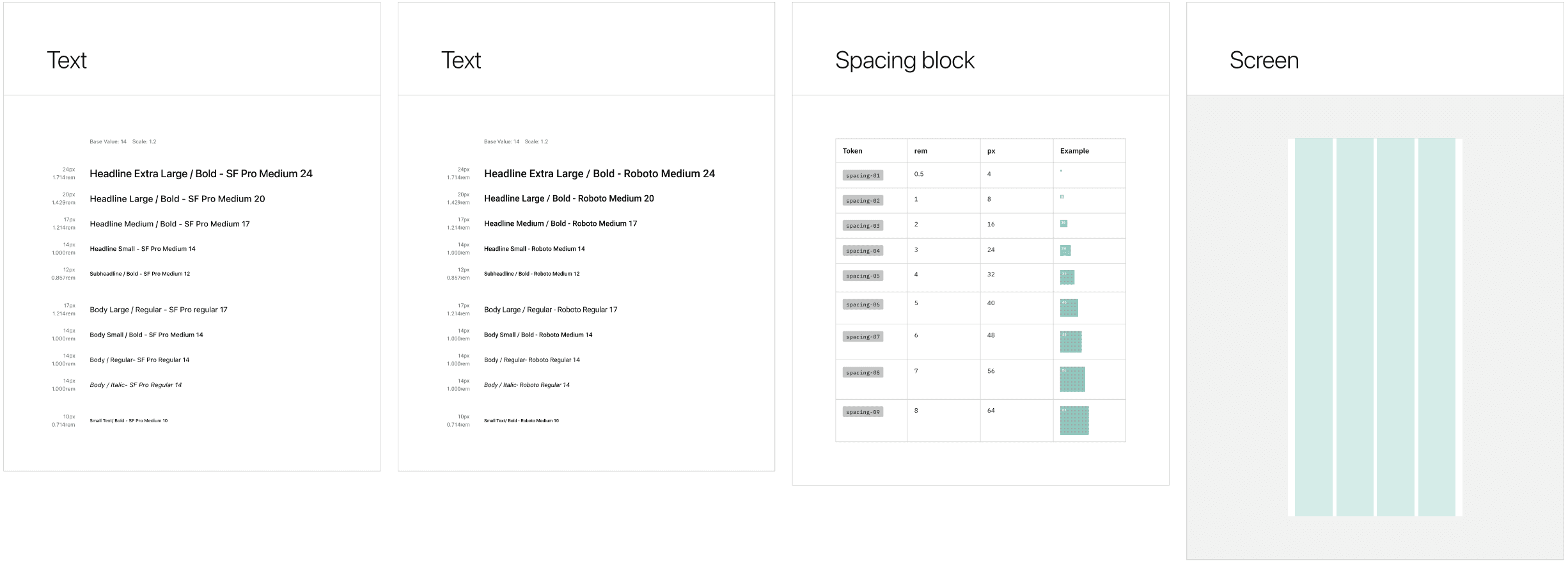
Typefaces
• San Francisco Pro for iOS
• Roboto for Android
• Aim for a native feel on each platform
Grid System
• 8-point grid as primary guide
• 4-point increments for finer adjustments
• Ensuring precise design alignment and visual consistency.
Space
• Used 8px base spacing
• Range from 4px (0.5 rem) to 64px
• Margin 16px
• 4-column
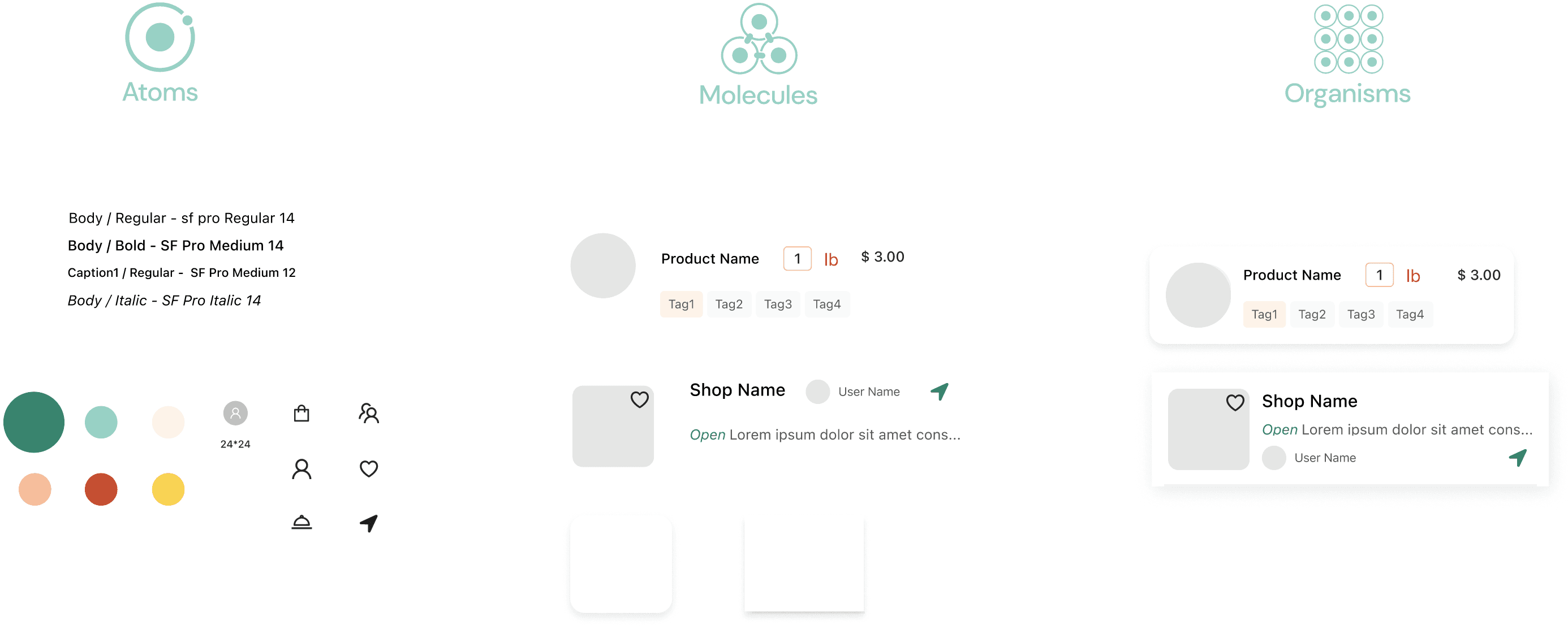

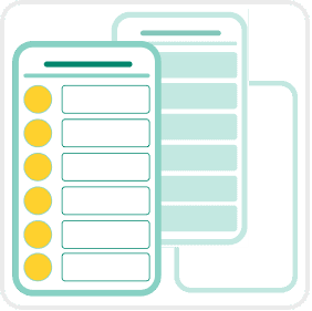
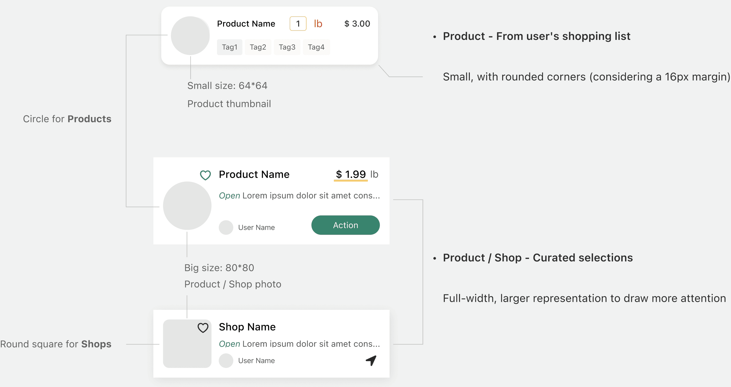
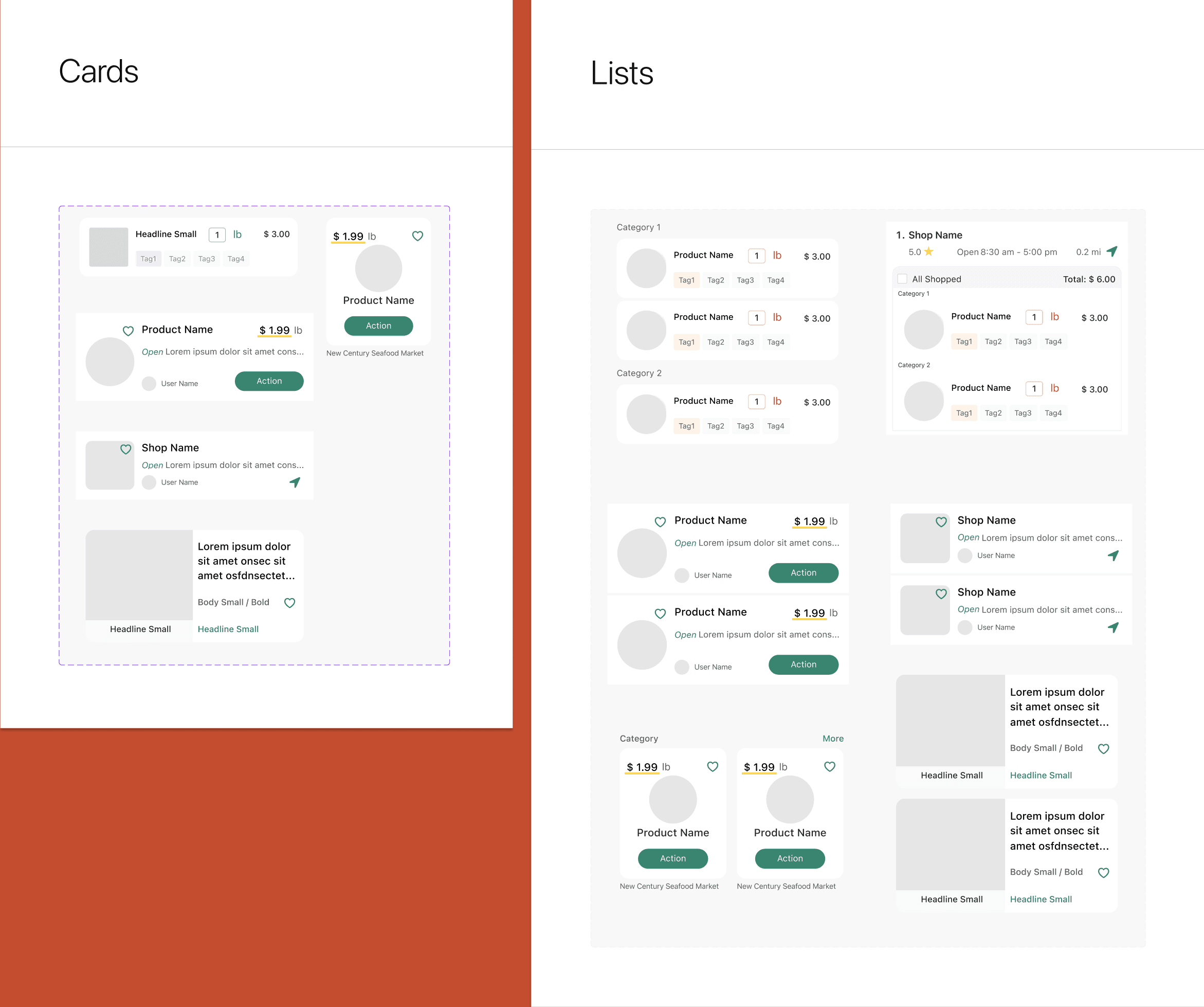
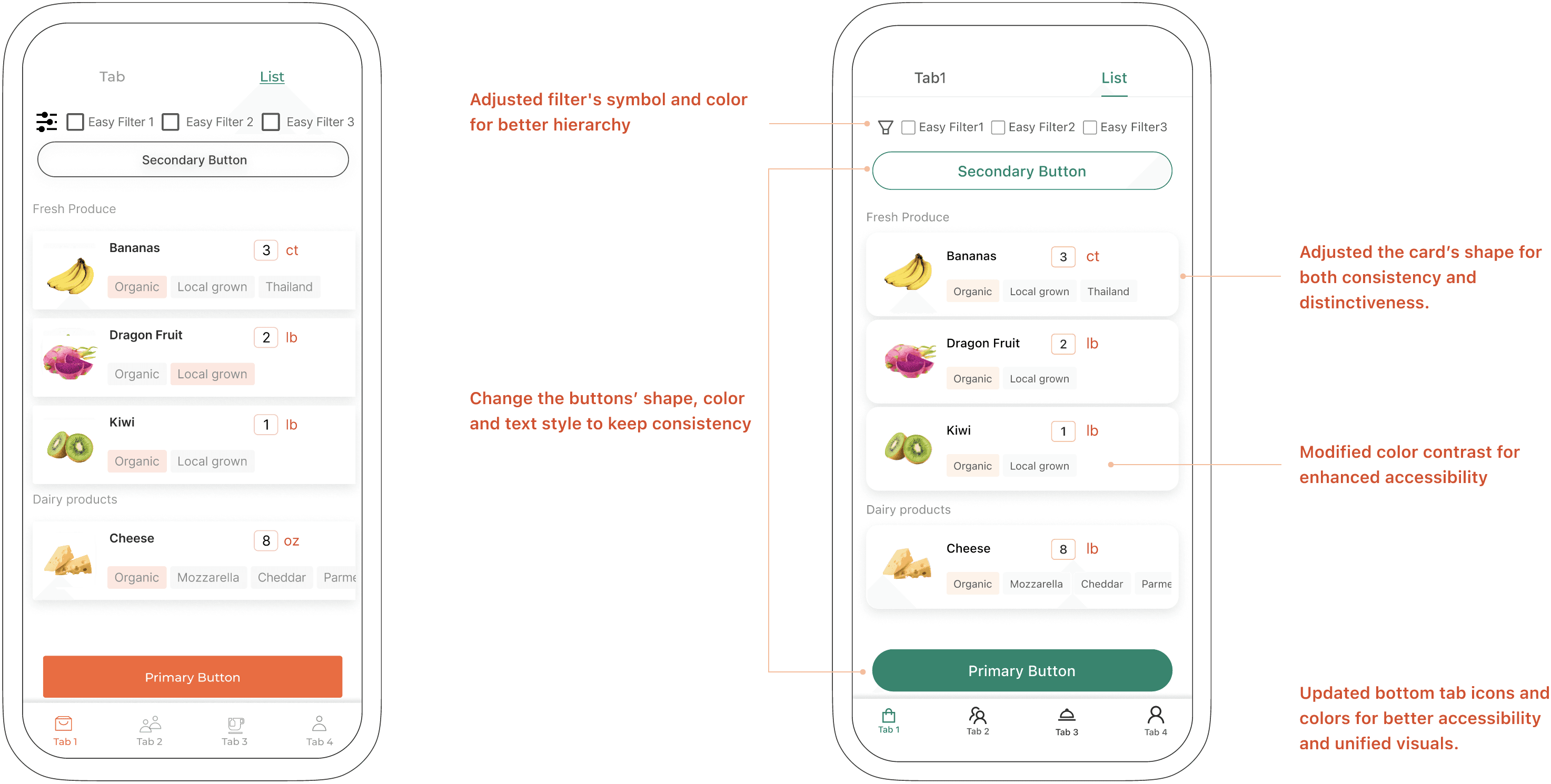
In our app, lists are assemblies of individual cards to benefit visual clarity, flexibility, and scalability. With multiple types of content to display, the challenge was to ensure that each card was consistent and distinctive.
Thus, the design of each card was crucial not just in its standalone form but also in how it would collectively appear in lists. This would allow individual cards to shine while forming a cohesive list.
To navigate this challenge, I leaned into the high-fidelity prototypes, making detailed adjustments to ensure our cards—and by extension, our lists—served their distinct purposes without sacrificing a consistent user experience.

Visual cues for differentiation
• Distinct image shapes per content type
• Size variation between user-created and community-curated cards
Visual hierarchy
• Prioritize crucial items
• Refine typographical weights
• Optimize icon usage
User motivations
• Trust what they're buying — showing enough info before adding to cart
• Feel in control — not overwhelmed by layout or info
• Save time — scanning and completing the list without cognitive friction
To enhance user distinction and engagement, I implemented differences in the image and card’s shape and dimensions.
Currently developing a flexible design system that accommodates AI capabilities— without redesigning layout structures.

Our design journey was driven by enhancing accessibility, establishing consistent visual language, and adeptly balancing consistency with distinct content presentation.
With the newly implemented design system, we've transformed our interface to achieve these aims better, offering an experience that's not only more accessible and uniform but also skillfully differentiated where needed.
Architectural decision
Decision – App design system kept separate from SaaS platform UI kit — prioritizing development speed for the platform, integrity for the core product.
Next phase – Consolidate both systems once the SaaS platform stabilizes and the UI kit becomes a limitation.
Inclusive design opportunity
WCAG 2.1 AA compliance: ✓ Met
Equal UX quality for CVD (Color Vision Deficiency) users: Post-MVP improvement – Ensure hierarchy and interactive states are communicated through multiple signals — not color alone — so the experience is equally clear for CVD users.
MORE PROJECTS
In-Store Shopping Assistance

Redesign LinkedIn Easy Apply

AI-Powered Authorization UX (Coming Soon)
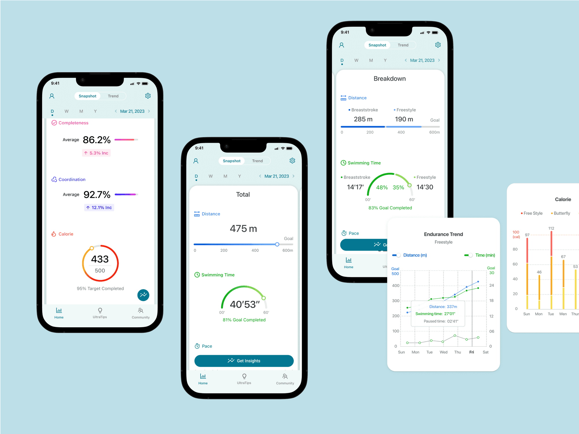
UltraSwim
© 2026 Su