
User Research
Dashboard Design
Usability Testing
MVP Clickable Prototypes
UI Components
Product Manager
Design Lead
Software Developer
Uncovering What Matters to Swimming Beginners
To better understand the target audience's swimming experiences and needs, I interviewed four target audiences to gain insight:
#1 Speed is not Beginning swimmers' first concern, and duration is.
"I want to be able to swim longer without taking breaks."
"I don't understand what causes me to run out of breath."
#2 Mainstream swimming apps that mainly focus on speed do not satisfy their needs.
"It is hard to find out what's wrong with my movements and the coordination of them, and how to correct it."
"I don't understand what causes me to run out of breath."
#3 Instead of taking classes, some swimmers prefer other flexible ways.
"I learned breaststroke by myself. I watched tutoring videos and then practiced in the pool."
Defining Target Audience: Beginning swimmers who want to improve their technique.


Insights from Competitor Analysis
To understand the existing solutions in the market, I analyzed competitors and learned:
Complex Dashboards
Features overwhelming dashboards loaded with technical jargon, e.g., SWOLF scores, which combine time and stroke count to measure swimming efficiency.
Insufficient Visual Aids
Lacks clear visual representations to effectively communicate data insights.
Accuracy Limitations in Data Collection
Relies solely on smartwatches for data collection, which may not capture precise metrics needed for accurate swimming technique analysis. This could lead to less reliable feedback for improving swimmer performance.
Design Opportunity
I identified opportunities based on competitive analysis:
Specialized Sensor Data
Utilizes data from sensors specifically designed for swimming, capturing detailed metrics like stroke distance, stroke time, kick distance, kick time, swimming time, pause time, etc. This rich data set allows AI to deliver comprehensive and precise analyses.
Enhanced Data Presentation
Information is presented clearly and comprehensibly through innovative terminology and effective visualizations, enhancing user understanding and engagement.
Word List for Consistency
Accurate · Simple · Fun · Motivating · Relaxing
In this project, a data list was created to clearly define and track the metrics that would be used in the dashboard to measure the progress of users in App. This data list helped to ensure that the dashboard effectively visualized relevant information, allowing users to easily understand their progress
1. Aligning Data Collection & User Needs with App Features: Showing Swimmers the Data They Care About
This project focuses on selecting and categorizing crucial metrics for analysis and user presentation in a swimming improvement app that features AI-powered training and movement correction. The metrics are broadly grouped into General Performance Metrics and Specific Movement Metrics.
- General Performance Metrics: Aid the AI in tailoring personalized training plans.
- Specific Movement Metrics: Form the basis for the AI to analyze and suggest improvements in technique, specifically targeting individual movement corrections.

2. Displaying Movement Correctness: Transitioning from Specific Data to User-Friendly Metrics
Starting with the question, "How can we show users our evaluation of their movement correctness?" I sought insights from a former swimming athlete. Through this interaction, I learned about 'Movement Efficiency,' which includes the 'Movement Completeness' metric and 'Movement Coordination' metric. These metrics offer a user-friendly way to convey the AI's assessment of the user's technique. They allow users to track their progress and strive for improvement without having to interpret specific, complex data.

1. Categorize
A former swimming athlete emphasized the importance of Endurance for consistent swimming duration and Movement Efficiency, based on the completeness and coordination of movement, to avoid energy waste, especially for beginners. These insights helped refine the data list, including a new term, Endurance, to ensure highly relevant metrics for users looking to improve their swimming technique.
To organize data in an understandable and intuitive manner for users and to ensure that the visual design and layout of the dashboard align with the underlying organization of data. I consolidated the metrics into three categories:


2. Group & Label
To offer historical context and motivate continuous improvement, I expand the original metrics to trend metrics and group them based on their effects on each other, which allows users to track their progress over time and see the correlation.

Dashboard-focus Information Architecture
To create straightforward and easy navigation, I use information architecture to help with the page and interface structure, taking the project vision, to build an AI-powered dashboard for the Swimming Technique Improvement App, to consideration to ensure a holistic experience.
I. A. of the Single-Screen Option
Emphasizes a unified and concise presentation. This approach allows for a quick and comprehensive view of core metrics, reflecting the principle of efficiency. By consolidating essential information into one screen, users can quickly grasp an immediate snapshot of their performance.

UX benefit of the Single-Screen Option
Allows users to review all the data on one page with simple scrolling down without page switching.

I. A. of the Multiscreen Option
Offers a more detailed and segmented data exploration. This design strategy divides information across various screens, catering to users who wish to delve into specific aspects of their metrics.

UX benefit of the Multiscreen Option
Show the current data on the home screen and move Trend data to a detailed page. This approach
aligns to offer tailored insights but avoids overwhelming users with too much information on the first page.

1. Solid and Gradient Colors Representing Different Facts of Swimming Performance
Solid color for Core Metrics
Time and Distance are depicted in a solid color, representing the foundational and directly measurable aspects of the swimmer's performance.
Gradient Colors for Complex Metrics
Pace, Coordination, and Movement Completeness are visualized with gradient color, signifying the intricate, multi-dimensional, and interdependent nature of these metrics.
This distinction helps convey the simplicity and directness of Time and Distance while also highlighting the more complex nature of Pace and Movement Completeness. It can create a visually engaging and informative experience for the user.

2. Deciding on the Chart Type
The design decisions were guided by an empathetic understanding of user needs, a precise analysis of the data's nature, and a creative approach to conveying complex relationships in an accessible way:
Understanding User Needs and Goals
Recognized that beginner swimmers are focused on endurance, pace, and calorie goals and are also concerned with movement efficiency.
Considering Data Nature
For continuous data like endurance and pace, choose line charts to reflect their ongoing trends. For discrete metrics like movement completeness/coordination, opted for bar charts to represent their discrete values. Given the flexibility of bar charts to visually represent paused time, multiple design options were created for A/B testing.
Highlighting relationship and Effects
Combined different chart types when necessary to emphasize how one metric affects another (e.g., how efficiency affects endurance).

Single-Screen Option (Following I. A. 1)

Multiscreen Option (Following I. A. 2)

Based on the A/B Testing results, 7 target audience participants were involved.
Learning Goals
Preferred Layout and Structure: To optimal app navigation and usability.
Understanding of Terms and Labels: To assess whether the terms and labels used in the app are easily understood by the users.
Performance Comparison Preferences: Comparing current performance with set goals VS comparing with yesterday's performance.
Visualization Preferences for Endurance Data: To determine how users prefer to visualize endurance data, such as paused time and overall readability, between bar charts and line charts.
Unmet Information Needs: To identify any additional information or features that users desire which the app currently does not provide.
Insights
Simplicity in Design and Navigation: Users prefer designs that prioritize simplicity and ease of use, emphasizing straightforward navigation.
Streamline Complex Visuals: Complex charts can overwhelm some users, indicating a need to simplify visuals to enhance user comprehension.
Positive Response to Goal Comparison: Users appreciate the goal comparison feature, especially for endurance metrics like distance and time. There's also a preference for tracking daily progress in movement coordination and completeness.
Preference for Line Charts: Most users favor line charts for their cleaner visual representation, although bar charts are noted for making specific data points more discernible.
Demand for Calorie Tracking: There is a strong user interest in adding a Calorie metric, underscoring an emphasis on health and fitness goals.
01 Restructure with Top Tabs "Snapshot" and "Trend"

Benefits:
Streamline navigation and improve content organization, offering a more precise and efficient user experience that separates summarized data from detailed trends.
02 Shifting Navigation from Dropdown to Horizontal Swipe

Benefits:
Simplifies user interaction by consolidating metrics into one view, eliminates repetitive dropdown actions, and provides a more fluid and efficient way to access specific style's data with just one swipe
03 Combining Metrics into One Card

Benefits:
Provides an immediate comparative view and enhances the understanding of individual style contributions to overall performance.
04
A: Including User's Goals in Both Snapshot and Trend
B: Including Dots on Line Charts for Specific Time Values

Benefits:
A:
Aligns the app with user objectives, provides personalization, and helps users track progress toward their goals, fostering motivation and engagement.
B:
Enhances readability, allows users to easily identify specific data points, and connects visual representation with precise values.
05 Adding New Metric: Calorie

Benefits:
Enriches the information available to users, aligns with common fitness goals, and offers a comprehensive view of workout effectiveness.

MORE PROJECTS
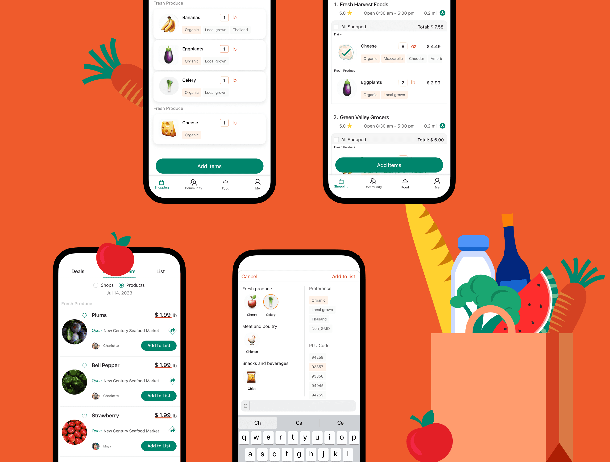
In-Store Shopping Assistance

Design System

Redesign LinkedIn Easy Apply

AI-Powered Authorization UX (Coming Soon)
© 2026 Su